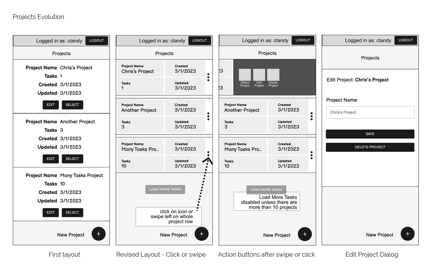
Projects Evolution
How the projects list page changed over time
A new application for creating and running tasks.
Role: UI & UX Designer
Tools: Figma, Adobe XD, Adobe Photoshop
Starting this greenfield project, I organized meetings with the product team and the api team to learn what features would make a good product in this case as well as what would be feasible from a development standpoint.
Problem: Users need to be able to rapidly build datasets of places, add them to tasks, and handle other management actions related to places, datasets, and tasks.
Solution: Design a tabbed system to quickly view existing tasks and datasets. The tasks and datasets should be to quickly view their associated datasets or places.
Problem: There are many operations that can be taken on either a task or dataset. Given sufficient hit area for each button, they use a lot of horizontal space in table rows.
Solution: Put actions on a menu in cases where there are more than a few actions. The menu item should include the same color and icon.
Problem: Once a user has opened a project they won't likely need to interact with the project until they're done working with tasks and datasets. It will remain important for the user to know which project they're working.
Solution: Make the projects section a separate page where all project operations happen. The currently opened project should show at the top of the page with a button to return to the project page.
Problem: Retrieving the dataset and tasks lists can take a significant amount of time. Development does not have time to build a complex loading indicator that provides state or step information.
Solution: Design a loading indicator that does some simple math based on count of tasks or datasets to better inform the user of how much time they might be waiting.
Problem: The paginator takes up too much space and potentially ends up being too small of hit areas. Would prefer to not need a paginator on mobile.
Solution: Instead of the paginator, mobile gets a “Load More” button w/ a label relative to the screen it’s on. Coupled with search and sort, this should be effective for finding a task or dataset.
Problem: The layout isn’t table-like on mobile, so column sorting needs to go somewhere else because we still need the feature.
Solution: Added a button next to the search that brings up a sorting dropdown.
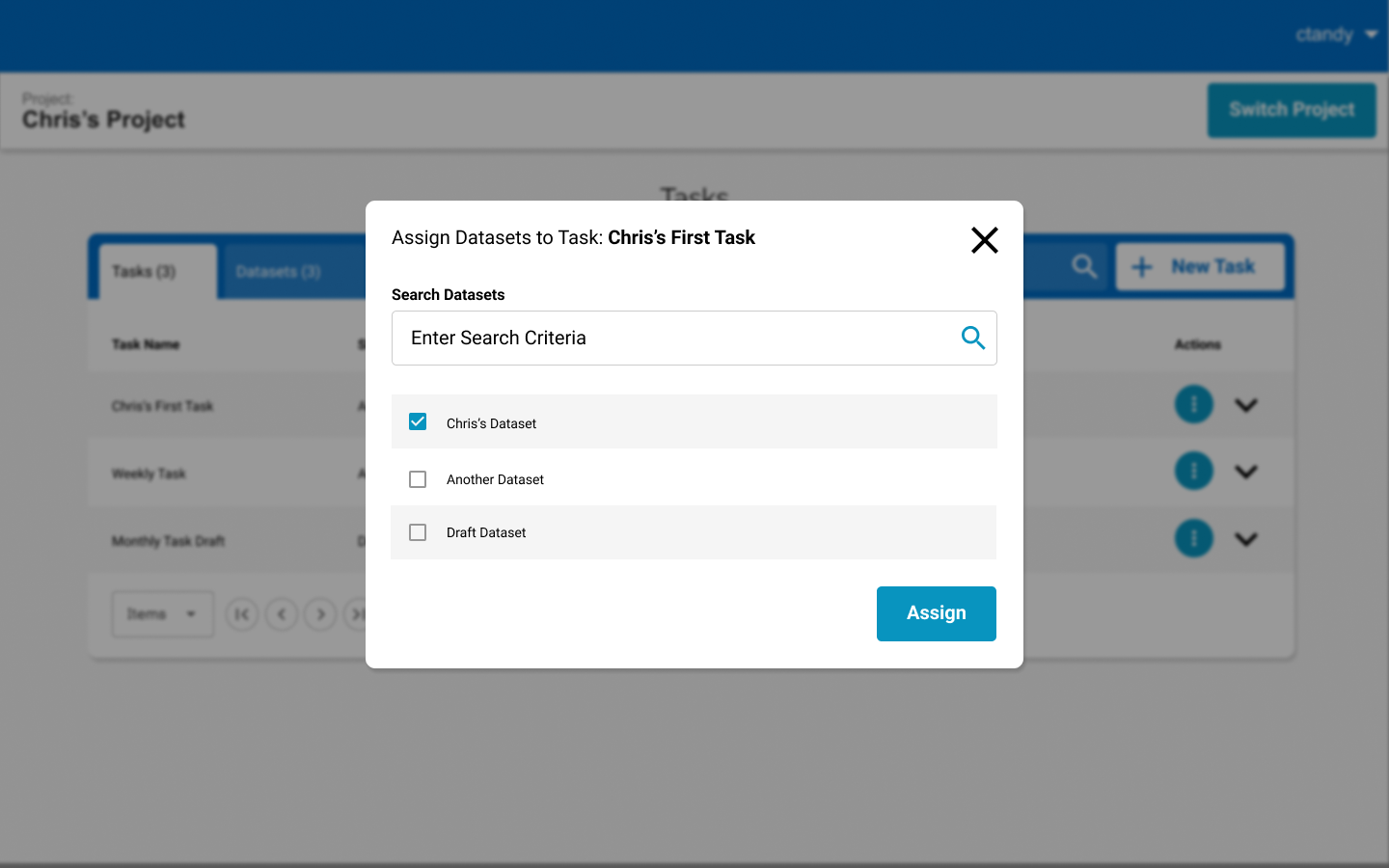
Problem: There is no drill down feature on mobile. A "view datasets" wouldn’t be differenet enough from the "assign datasets" dialog to warrant a second dialog.
Solution: Make sure the assign dialog second functions as a view.
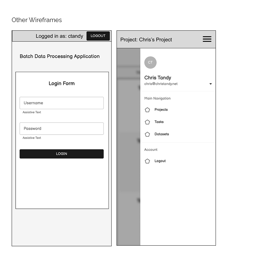
Problem: A second heading for the projects section on tasks and datasets takes up too much space on mobile. The limited amount of account options doesn’t justify an entire header for just the login stuff.
Solution: Combine the two headers into one on mobile. Account functions get put behind a burger menu leaving the rest of the header to show the current project.
How the projects list page changed over time
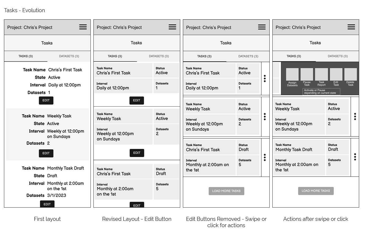
How the tasks layout changed over time
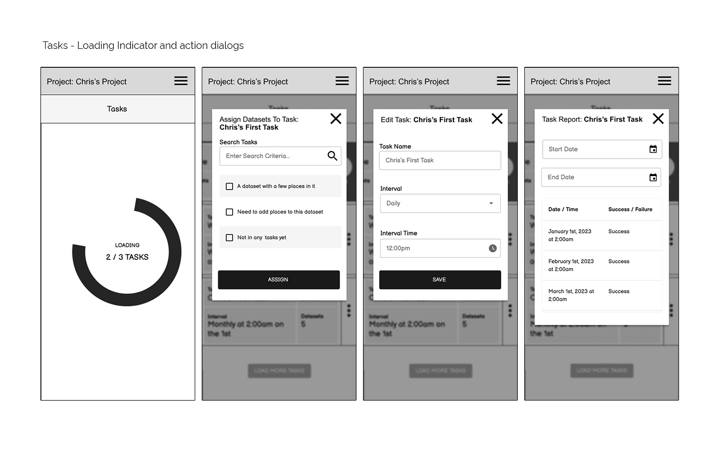
Follow-on Actions available on Tasks
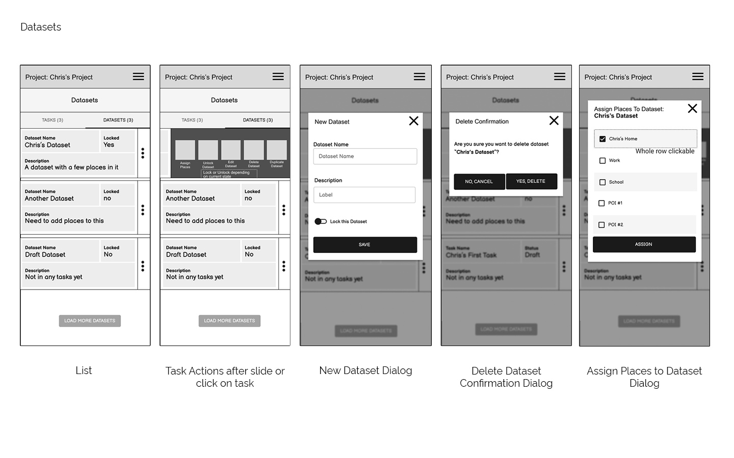
All the datasets wireframes
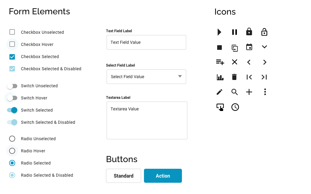
Other wireframes
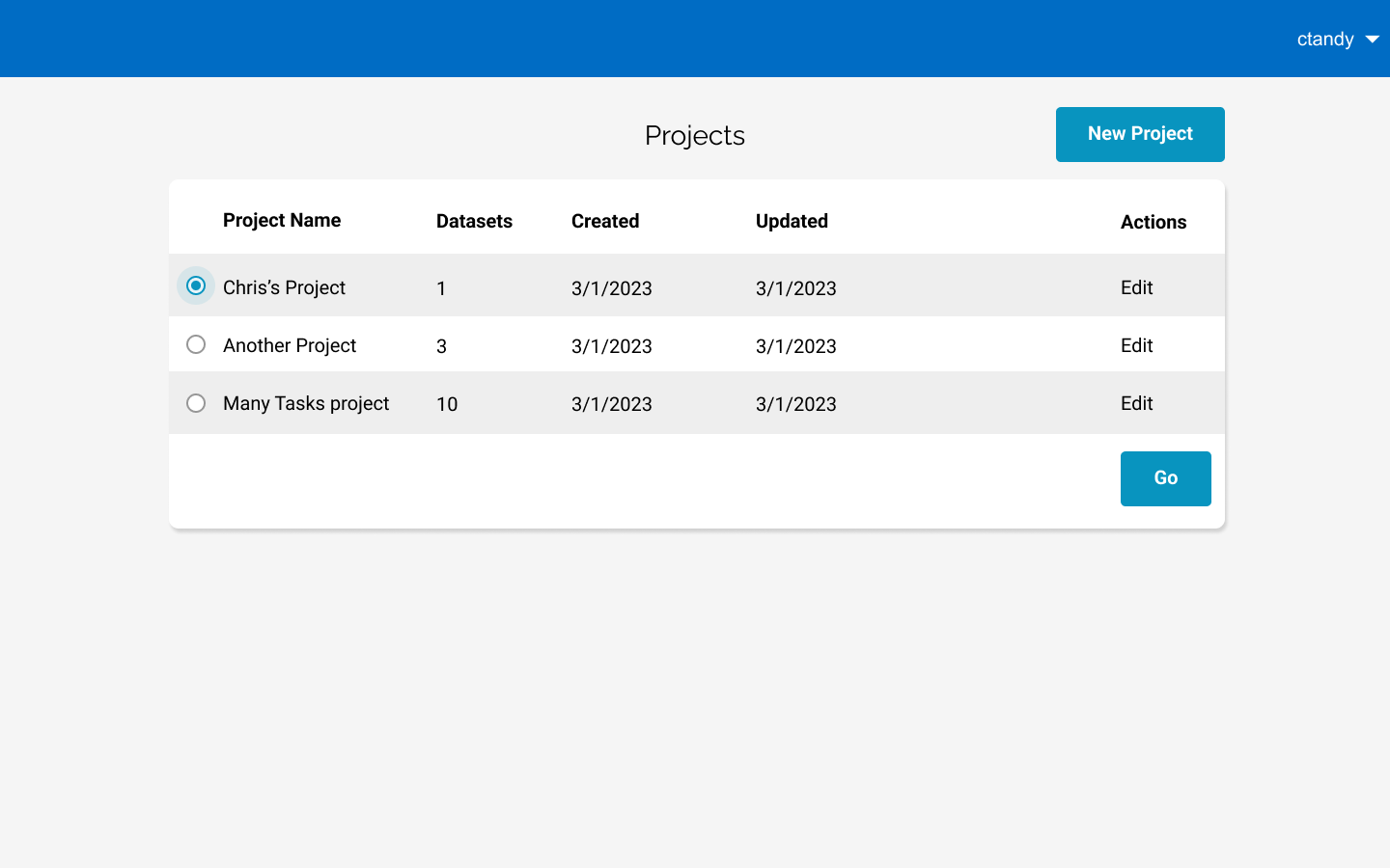
Users create or select a project first
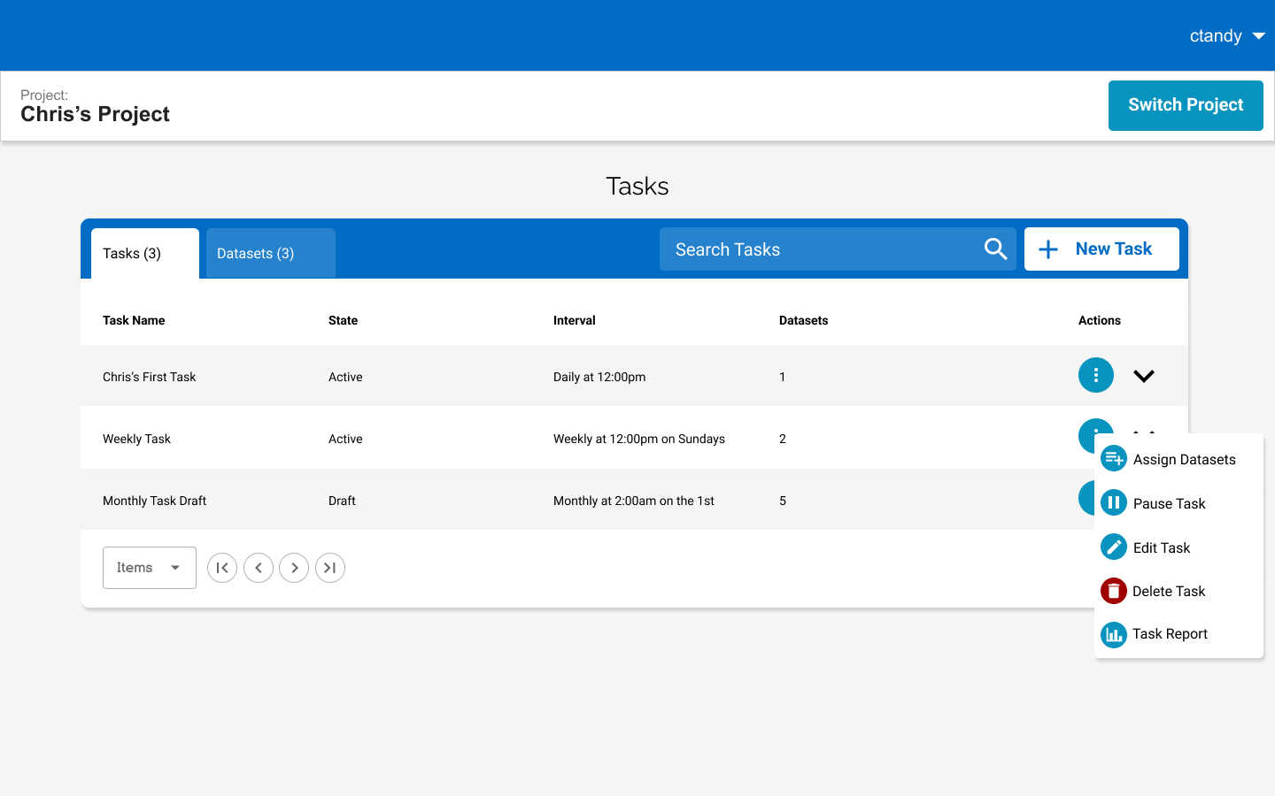
Tasks can be managed and expanded to show datasets
Datasets list populates from the users datasets
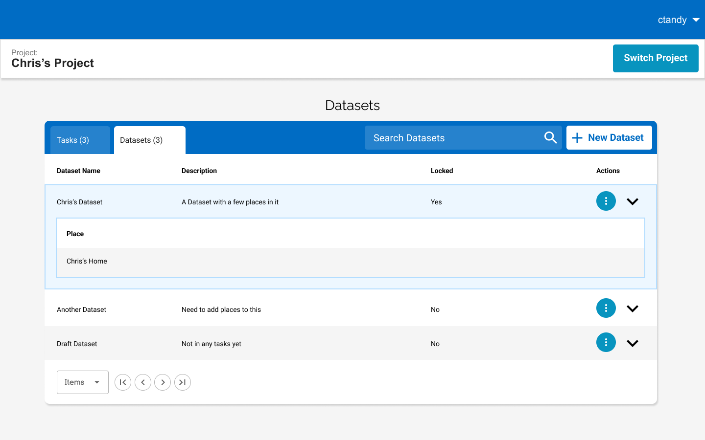
View of datasets, each dataset can be expanded to show places
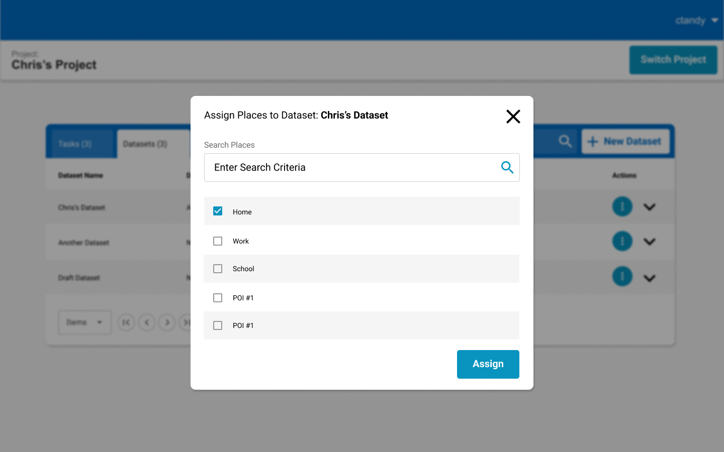
Users assign places from a pre-populated list
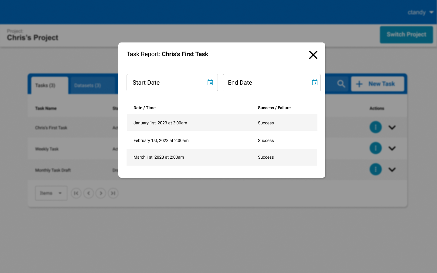
Shows users success or failure of tasks